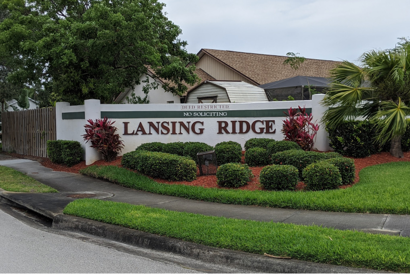
We were excited to partner with Lansing Ridge Homeowner’s Association to transform their website into one that was triple A level ADA compliant (fully accessible to people with certain disabilities). They also wanted an updated interface design that was more modern, organized, and minimalistic.

All great websites begin with planning. We made sure to research the latest ADA Compliant regulations before starting this project to ensure we we had the latest info. Next, we designed the layout through wireframing. Wireframing is a great way to get early feedback and focus on the best user experience without the distraction of colors, images, and other visual elements.
Once feedback was received and the layouts were adjusted, we started on the hi-fidelity mockups. This is where we design the interface with all its colors, fonts, and visual elements. After the hi-fidelity mockups were approved, our developer turned them into the responsive, ADA compliant website that it is today.
Whether you know what you want or still have some questions, we’d love to hear from you!
Please fill out the form below.